
Homepage Design Inspiration – a Weekend Roundup
If you’re looking for homepage design inspiration, this guide is for you. Whether building a new website or refreshing an old one, your homepage is your first (and often only) chance to convince visitors to stay.
A strong homepage starts with an effective hero section—the first visual and messaging element users encounter. It sets the tone and guides people toward exploring your site further.
In this post, we’re looking at five desktop website homepage designs that immediately capture attention through smart layout, messaging, and design. These examples show how strategic homepage design can create instant connections and drive action.
💡 What Is a Hero Section of a Website?
The hero section is the top part of a website’s homepage. It usually features a bold headline, a short description, a strong image or video, and a call-to-action button. It’s the first thing users see — and your best chance to impress.
✅ What Makes a Good Hero Section?
In any inspiring homepage design, a good hero section:
- Clearly explains what the site offers
- Loads quickly on mobile devices
- Uses eye-catching but purposeful visuals
- Includes a single, focused call to action
- Aligns with your brand voice and goals
🔍 5 Homepage Design Inspiration Examples
Here are five brands that nailed their homepage hero sections and insights you can use in your design process.
1. Airbnb
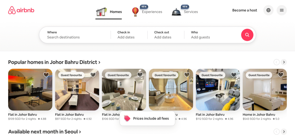
Search-first, Experience-rich
Why this inspires:
Airbnb skips the abstract headlines and goes straight to the good stuff: showing real listings near you. It feels almost like a curated feed, with categories such as “Popular homes in Johor Bahru” or “Stay next month in Seoul.” Instead of telling users what to do, Airbnb shows them what’s possible.
Even better, the layout encourages search-based exploration, with tabs for Homes, Experiences, and Services arranged clearly across the top navigation. It feels intuitive, localised, and completely focused on getting users to take action quickly. wholly.
Design Inspiration Tip:
If you offer a large catalogue or service library, structure your homepage to start where the user wants to go — visually and functionally.
2. GoPro
Visual Boldness Meets Clarity
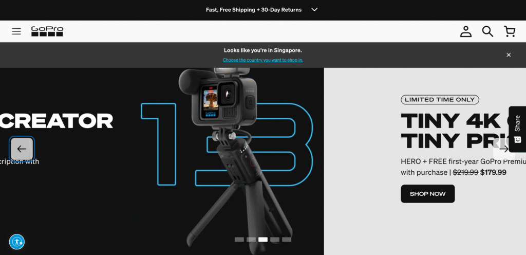
Why this inspires:
GoPro’s homepage design is a masterclass in emotional engagement. The full-screen ocean shot evokes adventure, spontaneity, and creativity — exactly what their audience seeks. The headline “FUEL YOUR CREATIVITY” adds emotional depth, while the “Shop Now” button offers a practical next step. This desktop layout feels cinematic — full-width, high-resolution video or photography backed by a concise line of copy and a clear CTA. The immersive feel grabs attention instantly.
The image also doubles as a product demo. That dual purpose is incredibly efficient on mobile, where space is limited. The whole section feels alive.
Design Inspiration Tip:
Use a background image or video that instantly shows your product in context. Support it with one emotionally charged line and a strong CTA.
3. Dropbox
Calm, Clear, Conversion-Ready
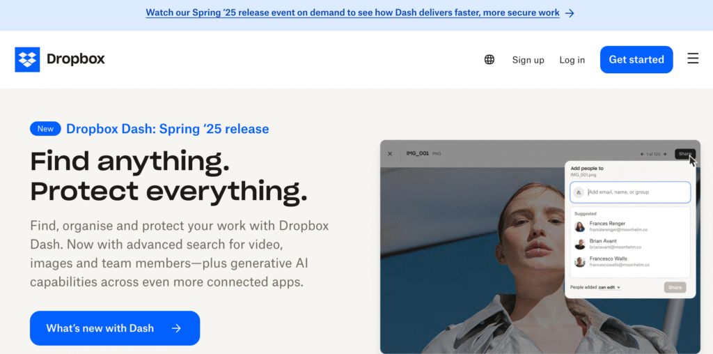
Why this inspires:
Dropbox proves that loud visuals are not necessary to create impact. Their homepage hero section uses white space, a calm colour palette, and one bold message: “Find anything. Protect everything.” It speaks to both personal and business users without being generic.
What makes this even smarter is the dual CTA structure: You can explore “What’s new with Dash” or start using Dropbox immediately. This caters to both new and returning users subtly but strategically. It’s a quiet and confident design. The dual CTA approach—explore new features or try Dropbox free—is well-aligned with user intent, offering choices without overwhelming.
Design Inspiration Tip:
Use contrast—not just in visuals but also in messaging—to guide different types of users through your homepage experience.
4. Apple
Minimalism with Meaning
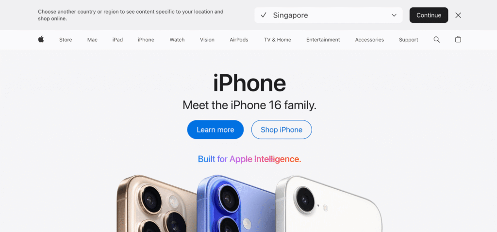
Why this inspires:
Apple’s homepage design uses restraint as a statement. There’s no fancy animation or pushy messaging. The line “The best way to buy the products you love” is confident and straightforward, and it’s supported by clear product icons (Mac, iPhone, iPad, etc.) just below. On a desktop, the visual scale is powerful. High-res images slide smoothly, and below the fold, users can dive deeper into specific categories like Mac, iPad, iPhone — each designed as its mini hero block.
On mobile, this minimal layout ensures ultra-fast loading and zero distractions. Even the help options like “Ask a Specialist” are integrated into the hero section, making support feel like part of the shopping experience.
Design Inspiration Tip:
If your product or brand is strong, let clarity and trust talk. Avoid clutter and focus your hero section on the user’s journey.
5. Notion
Friendly and Focused

Why this inspires:
Notion balances professionalism with personality. The headline “Powerful project management, without the chaos” gets right to the point — and many users deeply relate to it. It’s followed by a calm, friendly illustration that softens the tone without losing credibility.
The CTA “Get Notion free” is clear, nonthreatening, and conversion-oriented. On mobile, everything stacks perfectly, giving users one thing to read, one thing to see, and one thing to do.
Design Inspiration Tip:
If your offering feels complex, keep your hero section emotionally light but strategically strong. Focus on one problem and one solution.
🧠 Final Thoughts on Homepage Design Inspiration
Looking for homepage design inspiration isn’t just about aesthetics — it’s about clarity, functionality, and mobile-first performance. Great homepage hero sections:
- Speak directly to the visitor
- Show (not just tell) what the brand does
- Offer a simple next step
- Work seamlessly on both mobile and desktop
- Align every visual and word with a specific goal
Bonus Tip: My Favourite Homepage Builder
If you’re building your own website and want complete control over your homepage design with minimal coding, I highly recommend Divi by Elegant Themes. It’s my go-to WordPress theme for creating clean, mobile-responsive, high-converting homepage layouts quickly and easily.
Divi’s visual builder makes it simple to:
- Customise your hero section with drag-and-drop elements
- Adjust desktop and mobile versions side by side
- Launch beautiful, functional homepages — even if you’re new to web design
✍️ Want to Create a Homepage That Converts?
I help small business owners, freelancers, and creative brands build homepages that are not only beautiful but also built to convert—with SEO-smart copy, strategic design, and mobile-first thinking.
🡪Explore my homepage design services or contact me here to get started.